Ajuda:Guia de edição/Formatação: mudanças entre as edições
| Linha 263: | Linha 263: | ||
Imagemap: Mapear imagens para click | ===Imagemap: Mapear imagens para click=== | ||
<pre><imagemap> | <pre><imagemap> | ||
File:Example2.png|150px|alt=Alt text | File:Example2.png|150px|alt=Alt text | ||
| Linha 279: | Linha 279: | ||
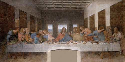
File:The Last Supper - Leonardo Da Vinci - High Resolution 32x16.jpg|thumb|center|500px|alt=''The Last Supper'' by Leonardo da Vinci - Clickable Image|Image map example. Clicking on a person in the picture causes the browser to load the appropriate article. | File:The Last Supper - Leonardo Da Vinci - High Resolution 32x16.jpg|thumb|center|500px|alt=''The Last Supper'' by Leonardo da Vinci - Clickable Image|Image map example. Clicking on a person in the picture causes the browser to load the appropriate article. | ||
poly 550 2550 750 2400 1150 2300 1150 2150 1200 2075 1500 2125 1525 2300 1350 2800 1450 3000 1700 3300 1300 3475 650 3500 550 3300 450 3000 [[w:Bartholomew the Apostle| | poly 550 2550 750 2400 1150 2300 1150 2150 1200 2075 1500 2125 1525 2300 1350 2800 1450 3000 1700 3300 1300 3475 650 3500 550 3300 450 3000 [[w:Bartholomew the Apostle|Usuário:Caiqueazael]] | ||
poly 1575 2300 1625 2150 1900 2150 1925 2500 1875 2600 1800 2750 1600 3250 1425 3100 1400 2800 1375 2600 [[w:James, son of Alphaeus|James Minor]] | poly 1575 2300 1625 2150 1900 2150 1925 2500 1875 2600 1800 2750 1600 3250 1425 3100 1400 2800 1375 2600 [[w:James, son of Alphaeus|James Minor]] | ||
poly 1960 2150 2200 2150 2350 2500 2450 2575 2375 2725 2375 2900 2225 3100 2225 3225 1600 3225 1825 2700 1975 2450 1925 2300 [[w:Saint Andrew|Andrew]] | poly 1960 2150 2200 2150 2350 2500 2450 2575 2375 2725 2375 2900 2225 3100 2225 3225 1600 3225 1825 2700 1975 2450 1925 2300 [[w:Saint Andrew|Andrew]] | ||
Edição das 20h34min de 7 de agosto de 2023
Página com a apresentação dos principais recursos visuais que podem ser utilizados para criação de páginas.
Botão
O botão funciona com a extensão Bootstrap Components.
{{#bootstrap_button: Título_da_página_wiki | Rótulo que deseja }}
Rocinha Criar conta Entrar Escrever um verbete
{{#bootstrap_button: Rocinha | Rocinha }}
{{#bootstrap_button: Especial:Criar_conta | text=Criar conta }}
{{#bootstrap_button: Especial:Autenticar-se | text=Entrar }}
{{#bootstrap_button: Wikifavelas:Escrever_um_verbete | text=Escrever um verbete }}
Exemplos de uso
Botão com link para página
Botão com texto de rótulo diferente do link da página
Botão ativado
Botão desativado
Botão especificado com a cor do tipo secondary
Botão especificado com a cor do tipo dark
Tipos de cores (color)
- default
- primary
- secondary
- success
- danger
- warning
- info
- light
- dark
- white
Tipos de atributos
- active
- class
- color
- disabled
- id
- outline
- size
- style
- text
- size
- sm
- md (default)
- lg
Etiquetas tipo parser
As etiquetas do tipo parser funcionam com as indicações:
< ... >seu conteúdo</ ... >
Bootstrap alert
<bootstrap_alert class=primary>Bootstrap Alert primary</bootstrap_alert>
Podem ser definidas as seguintes class: primary, secondary, success, danger, warning, info, light, dark, white
Bootstrap Card

Bootstrap card Content text
<bootstrap_card class="card-body">
[[File:Image2.jpg|frameless|200px]]

Bootstrap card Content text
</bootstrap_card>
Bootstrap accordion
Nível 1
Nível 2
Nível 3
Nível 4
Collapse
Este texto pode ser ficar oculto. Predefinição:Seção em destaque
This text is not collapsible; but the next is collapsible and hidden by default:
This text is not collapsible; but the next is collapsible and hidden by default:
Bootstrap collapse
Nível 1
Botão com imagem
Jumbotron
Meu jumbotrom
Meu texto apresenta as possibilidades do Jumbotrom
Modal
Panel
mesma função do card
Popover
Well
Tem a mesma função do card
Mais informações
Tags ativadas via extensions
Algumas estão em uso, outras ainda falta configurá-las neste teste.
Category Tree
<collegehumor>
<dailymotion>
<disclose>
<divshare>
<dynamicpagelist>
<embedvideo>
<evlplayer>
<funnyordie>
Gallery


Gfycat publicar um gif do site gfycat
<gfycat>https://gfycat.com/amazinghollowhedgehog</gfycat>
<iframe>
Imagemap: Mapear imagens para click
<imagemap>
File:Example2.png|150px|alt=Alt text
default [[Página principal|Ir para página principal]]
</imagemap>
outro teste
<indicator>
<info>
<inputbox>
<itimeline>
<jwplayer>
<kickstarter>
<languages>
<mediacccde>
<metacafe>
<nico>
nowiki
<pdf>
<poem>
pre formatado
<rating>
<references>
<rutube>
<smashcast>
<smwdoc>
<soundcloud>
<tagcloud>
<teachertube>
<ted>
<templatedata>
<timeline>
<tubitv>
<tudou>
<tvpot>
<twitch>
<twitchclip>
<twitchvod>
<videomaten>
<vimeo>
<vine>
<vplayer>
<yahoo>
<youku>
<youtube>
<youtubeplaylist>
<youtubevideolist>
Vídeos
<bambuser></bambuser> <bambuser_channel></bambuser_channel> <beam>teste beam</beam> <bing>teste bing</bing> <blip>teste blip</blip>
- ↑ Nota de rodapé